CITIZENS BANK CASE STUDY
This case study revolves around Citizens Bank. As a customer and using the company's already developed marketing and design language, I applied it across various different mediums like brochures, webpages, and postcards along with a new concept designs for the Citizen's Bank mobile app later on down the road.
Tools Used: Photoshop, Illustrator, InDesign, Adobe XD, Figma










BRAND GUIDLINES
Figuring out a good color palette for Citizens Bank wasn't the most challenging part of the process. The company seems to use a variety of different shades of green with your occasional orange in the mix. The typeface was also quite simple to discover, since the Arial font seemed to work nicely with the overall design language.
THE PROBLEM
As an avid user of the Citizens Bank mobile app, I have to say that I'm not much of a huge fan of the current mobile application. So as a user of the application, I designed the application towards how the average would enjoy their bank information to be organized and laid out and presented in front of them. The current application was very barren and didn't have much going for it when it comes to being able to easily and effectively keep track of your finances in a way that feels seamless and thorough.
Hi-Fi User Happy Path
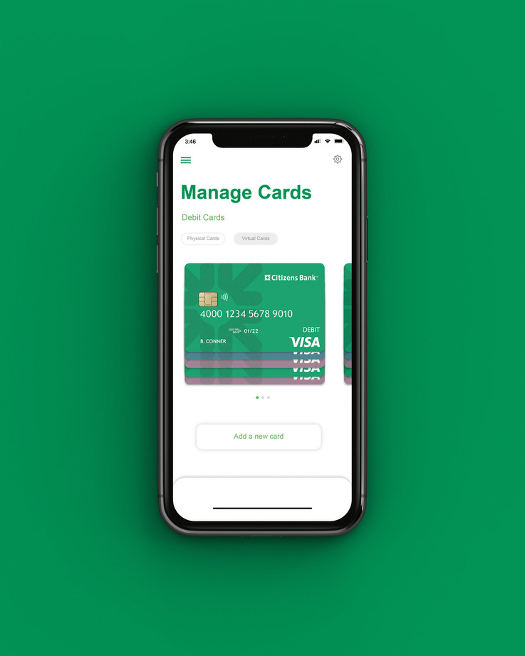
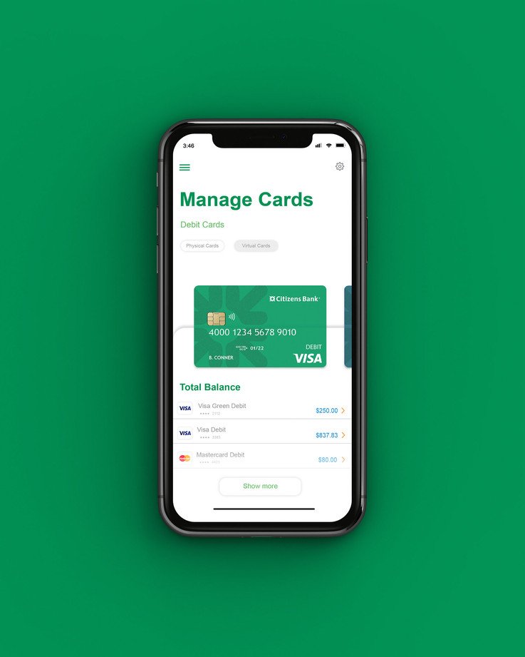
A high fidelity showcase of what the user will most likely encounter while interacting with the application.
FINDING THE FLOW
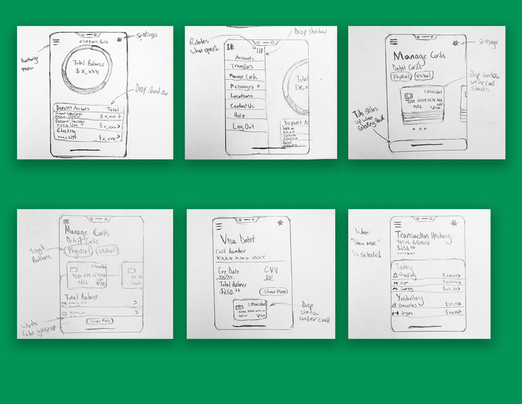
Using the research I gathered, I did a little bit of brainstorming and constructed a user task flow of what could potentially be a user scenario starting from what the user plans to achieve, to their journey to achieve it.
THE RESEARCH
During the research phase of the design process, I gauged various different types of banks and how they structure their mobile application design system. I researched companies like Capital One and Wells Fargo to see how their bank applications operate. Afterwards, I took my research to Pinterest to pick up any sort of design trends that were common amongst more up-to-date bank application trends and techniques.
After doing some research, I looked to my colleagues for more insight on my discovery. I conducted a personal survey to see what exactly would they want to see in a bank application, and what kind of application they're using currently to keep track of their finances. I also asked if they're enjoy their experience with their application or if there are certain things that they'd want to see improve. With their bank's application.
A handful of colleagues (40%) mentioned how their bank application had little to no ways of managing the way they keep track of their finances via the cards they use. They also mentioned how the transaction history for other competitors aren't exactly the most thorough. 60% of the colleagues I interviewed mentioned that they'd like the ability to manage all of their bank and checking accounts in a way that's easier for them instead of having to budget manually.
THE DESIGN GOAL
With all of the research gathered, and feedback from my peers, the goal for this updated Citizens Bank application was to be able to effectively better manage and keep track of your finances real time, as well be able to track all of your transactions made across all of the different types of credit and debit cards a user could have safely within the application.
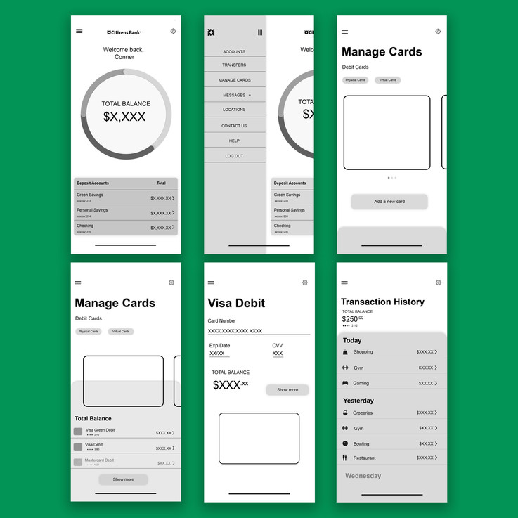
A welcoming home page that displace your current balance across all deposit accounts. Deposit accounts also shows the total balance across all account whether it's a savings account, personal account, and checking account.
A "hamburger" menu for quick access to more options. Removed options like "Pay Bills" and "Send Money with Zelle" since these options aren't functional within the current application.
A clean display of stacked credit and debit cards to keep track of the balances of each individual card. Also included with the option to add a new card that wasn't already included within the Managed Cards section.
Within each stack of cards will have its own personal transactional history with its own personal total balance listed.
When a card is selected for more information, the user can view the balance of that card as well as other extra information such as the expiration date and CVV code (The display card will not show that information).
Finally, when a user takes a look at the transaction history, the user can see what purchases were made, the remaining balance, as well as what day the purchase was made.
THE BROCHURE
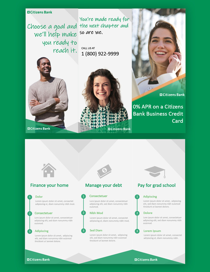
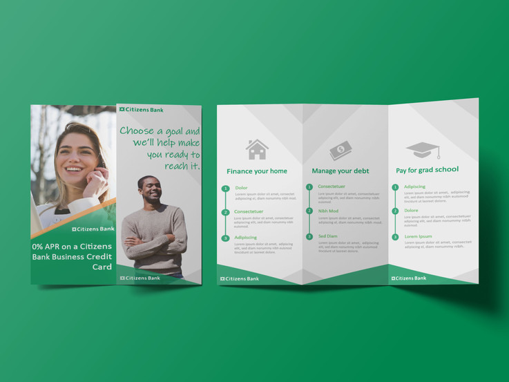
With this brochure, the goal was to convey what Citizens Bank is able to do for their members in a short, sweet, and easy to digest manner. By doing this, I made sure to study the company's strongest areas in what makes them stand out. As well as using their most recent promotions as a way to grab a customer's attention. Using a good amount of masking hierarchy, I managed to create a feeling of both sophistication and satisfaction.
THE POSTCARD
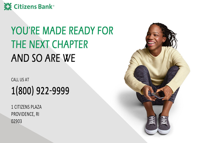
With this postcard, the objective was to use the bank's major promotions as a means to peak a customer's interest. I was also aiming to make sure that the information presented was short, sweet, and to the point with contact information to fall back on.
RETROSPECTIVE
CHALLENGES
One of the major challenges for this case study was accurately capturing Citizens Bank's brand identity while accurately executing on the pain points they were lacking in. With pain points like the application being lack luster and barren with very vague and unengaging visuals.
The other challenge was figuring out a way to accurately capture Citizens Bank's already effective marketing strategies. To do this, I needed to reference things like the company's website landing page and mobile app to get a good understanding of the overall design language. Being a customer of the bank, I also needed to use items that I've already received from the bank like brochures, folders, magazines, and postcards.
WHAT CAN BE IMPROVED?
I can say that the direction I took for the webpage could be done differently. Since this was around the time I was experimenting with my design skills, I focused less on the functionality of the site, but more on the aesthetics instead. Having good aesthetic is great, but also holding user experience to the same high standard would result in an excellent design experience as a whole. Getting more familiar with prototyping in Adobe XD would be another beneficial skill to obtain.
WHAT'S NEXT?
I plan on studying and working more on balancing my webpage designs. It was easy for me to get carried away with "wowing" viewers on visuals while losing track of what makes a good user experience great. I also plan on familiarizing myself on more design trends and tools when it comes to creating user experiences for both desktop and mobile applications to better enhance my work.